Color-Savvy, not Color-Crazy
You don’t have to let color selection drive you color-crazy!
Let’s shine a light on some critical elements for color selection in your home or work. The lighting in a space influences our perception of color. Understanding various lighting conditions and how to evaluate them ahead of time will transform the process of color selection from a daunting challenge into an enjoyable endeavor.
It makes sense to pick a color you like when selecting colors. Still, without understanding how lighting affects the way you view color, you may or may not like that color under your lighting conditions at home. Just like you would measure first to ensure the piece of furniture would fit, you must assess each room before selecting a color.
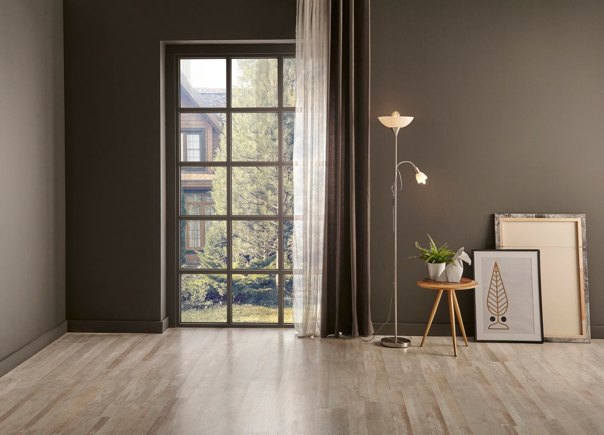
Where is the light coming from? This is the easy part. Scan and document the room for all light sources before going shopping. Take note of all possible lighting sources: natural light from all windows, can lighting, fan lights, table lamps, task lights, etc.
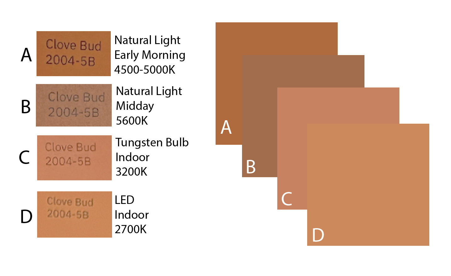
What are the light sources' color temperatures? This part requires a little more explanation. Although this isn’t a scientific paper, I will highlight the scientific concept of color temperature. The color temperature of light is a way to categorize visible light and how it appears. It is measured in degrees of Kelvin (K) on a scale of 1,000 to 10,000. Let’s examine two common reference points: household tungsten bulbs and natural sunlight.
Household tungsten bulbs emit warm, slightly yellowish light (2500 to 3200 Kelvins). Kelvin scale light transitions from warm yellow to neutral white and then reaches its peak in the bluish spectrum. At noon, the sun emits much whiter light (5500 to 6500 Kelvins), accentuating blue. These different temperatures are pivotal in shaping our perception of color because the same color will look different under each unique temperature. The color temperature is typically written on the package or the bulb itself.
Take a look at an experiment I ran, utilizing the same paint chip and documenting it under different color temperatures:
What are we doing in the space, and how do we want to feel doing it? What we do in the office is very different than what we do in our bedroom! To get our work done during the day and through the afternoon, we want lighting that energizes us and promotes focus, unlike our bedroom, which is our sanctuary of rest and rejuvenation! Aim for high color temperatures for active spaces and lower color temperatures for spaces where we are looking to wind down. It is worth noting that if you never see your space in the midday sun, it’s not worth considering how that color looks at that particular time of day. Also, window treatments can alter the amount of light in a space.
Picking the color! Most stores utilize fluorescent lighting, which falls around 4500 to 6500 on the Kelvin scale. Most homes use a variety of lighting that typically falls in the range of 2500 to 5000K. An item at the store may look different at home. There are some items like fabric swatches, flooring samples, and paint chips that you can bring home and look at under your lighting conditions. However, if you can’t bring samples home, don’t worry.
You can still make informed choices by utilizing the front section of the store, which often features large windows and abundant natural light. In this iPhone age, you can download apps that read the color temperature through your camera. Knowing the precise color temperature at the store and at home, you can confidently evaluate the relative difference between the color temperature at your home or office and what you view in the store.
This thoughtful approach to color selection by first evaluating color and light will increase your assurance and satisfaction with your color selections. Doing so will create a living or working environment that authentically reflects your favorite colors, bringing forth your chosen palette’s true essence and beauty.
No more color-crazy — you are now color-savvy!